Optimize Product Pages: 19 Ideas to Increase Conversions
19 actionable ideas to optimize your ecommerce product page and increase conversion rates: CTAs, photography, social proof, pricing, and more. With examples.
The average ecommerce conversion rate sits at 2.5-3% across most categories. That number isn’t a ceiling - it’s a baseline. The difference between a 2% and a 4% conversion rate on the same traffic is double the revenue without spending an extra cent on acquisition. According to the Baymard Institute (2024), 70.19% of online shoppers abandon their cart before purchasing - and the majority of those abandonment decisions happen on the product page itself, long before checkout.
I’ve audited product pages across dozens of ecommerce brands, and the same fixable mistakes appear repeatedly: weak CTAs, confusing layouts, missing social proof, and friction-filled trust signals. This guide covers 19 specific ideas you can implement without a redesign. If you want the broader CRO framework behind these tactics, the CRO for ecommerce pillar guide covers the full methodology.
Key Takeaways
- 70.19% of shoppers abandon before purchasing (Baymard Institute, 2024) - product page friction is the primary cause.
- CTA button placement, contrast, and white space are the highest-impact, lowest-effort improvements on most product pages.
- Product images are a primary purchase driver online - Baymard found that insufficient imagery is a top reason for abandonment.
- Reviews increase conversion rates by up to 270% for products with 5 or more reviews vs. none (Spiegel Research Center, 2017).
- Free shipping and clear return policies are the two trust signals most likely to recover hesitant buyers.
How Do You Optimise the Call to Action on a Product Page?
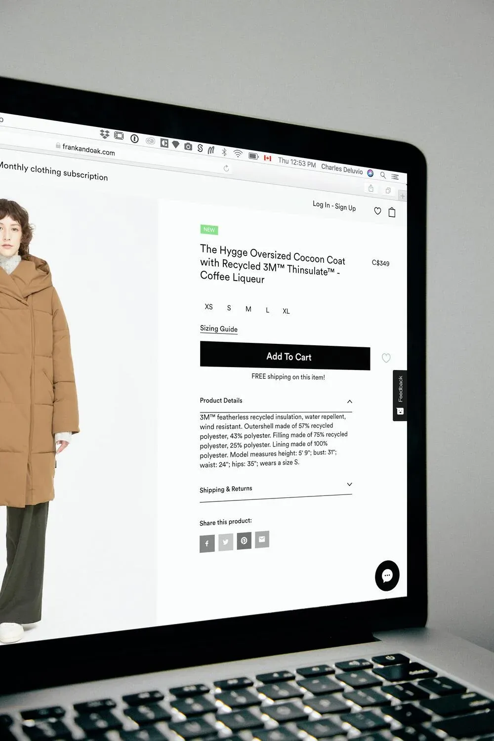
The CTA is the single most important conversion element on any product page. According to CXL Institute (2023), A/B tests on CTA design show consistent lift of 10-35% when buttons are made more prominent through contrast, size, and surrounding white space. On a product page, the primary CTA is almost always “Add to Cart” - everything else on the page should support that action, not compete with it.
Make the CTA the Visual Anchor of the Page
Your “Add to Cart” button should be the first thing a visitor’s eye lands on above the fold. Visual hierarchy theory tells us that size, contrast, and position determine what gets attention first. The CTA should be larger than surrounding elements, in a color that contrasts with the page background, and surrounded by enough empty space to breathe.
Look at GearExpress or Mango.com: single, highly visible CTA, nothing competing for attention in the same zone. That restraint is intentional. Every extra button, link, or option near the CTA introduces friction - a moment where the visitor’s eye drifts and the purchase impulse weakens.
Use High-Contrast Button Colors
Contrast is about standing out from the page - not matching your brand palette. If your brand color is blue and your page background is also blue-toned, your CTA button will disappear. Test a button color that clashes slightly with the dominant page color: orange on blue, green on white, red on grey. The goal is immediate visibility. Dockers’ product page uses exactly this principle - the CTA is unmissable within 2 seconds.
Surround the CTA With White Space
White space isn’t empty space - it’s a conversion tool. A button surrounded by other elements forces the visitor’s eye to scan and choose. A button with breathing room around it commands immediate attention. This is one of the easiest wins on any product page: increase the padding around your CTA and measure the impact in your analytics.
What Persuasive Design Principles Improve Product Page Conversions?
Persuasive design isn’t manipulation - it’s reducing friction between intention and action. According to Baymard Institute (2024), the average ecommerce product page has 7-8 usability problems that create friction. Fixing even 2-3 of the highest-impact ones typically lifts conversion meaningfully.
Minimise Visual Complexity
Complex pages demand more cognitive effort. Every extra element - banner, popup, sidebar widget, social feed embed - adds to the mental load a visitor carries. Apply the KISS principle (Wikipedia): the simplest version of a page that still communicates value is usually the highest-converting version. Remove distractions incrementally and measure the effect with A/B tests.
Maintain Prototypicality
Prototypicality is the gap between your page’s design and the mental template visitors carry for “ecommerce product page.” Our brains pattern-match constantly. A product page that looks unfamiliar creates subconscious hesitation. Navigation top-left, product image left, buy button right, price visible - visitors expect these conventions. Deviate from them only when you have a strong tested reason to.
Build a Clear Visual Hierarchy
Visual hierarchy tells the visitor what to look at and in what order. Size is the most powerful tool: larger elements command more attention. Color is the second: bright or contrasting tones pull the eye. Position is the third: top-left receives the most initial attention in Western reading patterns.
Your hierarchy should follow purchase intent: product image first, product name second, price third, CTA fourth. Everything else - description, specs, reviews - follows below. If your current layout inverts any of these, that’s a test worth running.
One Action Per Screen
Above the fold, present one action. Not two, not three - one. Everything visible without scrolling should point toward “Add to Cart.” Secondary actions (save to wishlist, share, compare) belong below the fold or in a secondary visual tier. Tricker’s shoe product page is a clean example: one dominant action, nothing competing.
What Typography and Content Rules Lift Product Page Readability?
Body text below 16px significantly increases abandonment on mobile, where most product page traffic originates. Optimal line length is 50–75 characters per line — beyond 80 characters, horizontal eye movement increases reading fatigue and visitors stop before reaching the CTA. Readability is a conversion variable, not a design preference. (CXL Institute, 2023)
Readability directly affects conversion. If visitors struggle to read your product description, they stop reading - and stop buying. According to CXL Institute (2023), body text smaller than 16px significantly increases abandonment rates on mobile, where the majority of product page traffic now originates.
Use 16px Minimum for Body Text
16px is the web standard for body text for good reason. At 12px or 14px on mobile, text becomes effortful to read. Effortful reading is a friction signal - visitors associate it with a low-quality store. Check your product description font size on a real mobile device, not a desktop preview. Many themes render smaller than designed on actual phones.
Stick to Standard Fonts for Descriptions
Custom decorative fonts work for headlines and brand marks. They don’t work for 200 words of product description. Arial, Georgia, and Helvetica are standard because they’re optimised for screen legibility. Readers scan faster through familiar letterforms. Save your custom typography for the brand name and H1 headline.
Keep Line Length to 50-75 Characters
Optimal reading line length is 50-75 characters per line, according to CXL Institute (2023). Lines longer than 80 characters force excessive horizontal eye movement and increase reading fatigue. On widescreen displays, constrain your product description column width rather than letting text span the full viewport. A narrower, readable block of text converts better than a wide, visually dense one.
Break Text Into Digestible Chunks
Product descriptions are not novels. Break them into short paragraphs (3-4 lines maximum), use bullet points for features and specifications, and add subheadings every 2-3 paragraphs for scanners. Lacoste’s product pages use this well: concise bullets, short paragraphs, clear breathing room. Shoppers scan before they read. Make sure your key selling points are visible in a 5-second scan.
How Do You Reduce Doubt and Friction on a Product Page?
Doubt is the purchase-killer. A visitor who isn’t sure about sizing, shipping costs, or return policy won’t click “Add to Cart” - they’ll leave and maybe come back later (often they don’t). According to Baymard Institute (2024), 48% of cart abandonments are triggered by extra costs (shipping, taxes) revealed too late, and 24% are triggered by being forced to create an account or navigate unclear policies.
Show Payment Options Near the Price
Financing options (installment payments, buy-now-pay-later like Klarna or Afterpay) should appear near the price, not hidden in the checkout footer. A €300 product shown as “€50/month” is a different psychological proposition. Decathlon displays installment options prominently on product pages - it reduces sticker shock and opens the product to buyers who can afford the monthly amount but not the lump sum.
Communicate Shipping and Returns Clearly
Free shipping is the single most effective conversion lever in ecommerce. According to Shopify (2024), 66% of online shoppers expect free shipping on every order. If you offer it, make it unmissable on the product page. If you don’t offer it universally, show the shipping cost and timeline before the visitor reaches checkout.
Return policy confidence matters just as much. A clear “30-day free returns” statement near the CTA removes one of the most common hesitations: “What if it doesn’t fit?” HappySocks puts both delivery and returns information directly beneath the Add to Cart button.
Provide Accurate Size Information
Sizing friction is one of the leading causes of product page abandonment in fashion and sportswear. I’ve worked with a client whose size guide was buried three clicks deep - moving it to a modal directly on the product page increased add-to-cart rate by 18% within two weeks, with no other changes. Don’t make customers hunt for this information.
Beyond a standard size chart, smart sizing tools like FitAnalytics (now part of Snap) guide customers to their correct size based on body measurements and brand-specific fit data. TheNorthFace uses this approach. The investment in a sizing tool is modest; the return in reduced returns and increased confidence-to-buy is significant.
Include Relevant Technical Specifications
Technical product buyers need specific information to make a decision. A triathlon suit buyer wants to know the chamois padding spec and the temperature usage range. A cyclist buying wheels wants weight, spoke count, and compatibility. Gobik’s product pages show this well: technical specs are surfaced prominently for buyers who need them, without overwhelming casual browsers.
Use a tabbed layout for products with complex specifications: “Overview” tab shows selling points and lifestyle images, “Specs” tab shows technical data. This serves both buyer types without cluttering the primary purchase zone.
How Do You Use Social Proof and Cognitive Biases to Increase Conversions?
Products with 5 or more reviews convert at 270% higher rates than those with none. UGC — real customer photos and videos — is 2.4x more likely to be perceived as authentic than brand-created content. Displaying the star rating and review count directly below the product name, before the price, is the sequence that maximises the social proof effect on purchase intent. (Spiegel Research Center, 2017; Hootsuite, 2024)
Social proof is one of the most effective conversion tools available to ecommerce brands. According to Spiegel Research Center (2017), products with 5 or more reviews convert at 270% higher rates than products with no reviews. The effect compounds at 100+ reviews, where the conversion lift becomes structural rather than marginal.
Use Reviews as Proof, Not Decoration
Bandwagon effect: people follow people. Seeing that 847 other customers bought and rated a product 4.7/5 removes a significant chunk of purchase hesitation. Amazon’s review system is the gold standard, but even 10-20 genuine reviews on a product page outperform zero reviews by a large margin.
Display the star rating and review count directly below the product name - before the price. This is the sequence visitors expect, and it front-loads the social proof before the price commitment. If you have fewer than 5 reviews on most products, email a post-purchase sequence asking customers to leave one. The ask is simple; the conversion impact is significant.
Beyond text reviews, UGC (User-Generated Content) - real customer photos and videos using the product - consistently outperforms studio imagery for social proof. According to Hootsuite (2024), UGC is 2.4x more likely to be seen as authentic than brand-created content. Integrate a customer photo gallery into the product page if your platform supports it.
Use FOMO and Scarcity Signals
FOMO (Fear of Missing Out) is a legitimate conversion driver when used honestly. Low stock messages (“Only 3 left in this size”) create urgency that accelerates purchase decisions. Decathlon uses this well: when a product drops below a low stock threshold, a clear message appears on the product page.
The key word is “honestly.” Fake scarcity - a countdown timer that resets, or a “Only 2 left!” message that never changes - destroys trust when customers notice. Use real inventory thresholds and set them at the level that genuinely reflects limited availability. Authentic scarcity signals convert; manufactured ones damage brand credibility.
For a deeper look at how cognitive biases apply across the full funnel, the cognitive biases for conversion optimization guide covers 19 specific biases with ecommerce examples.
Frequently Asked Questions About Product Page CRO
What is the average ecommerce product page conversion rate?
The average ecommerce conversion rate across categories is 2.5-3%, according to Baymard Institute (2024). Top-performing product pages in competitive categories reach 5-8%. The gap between average and top-performing pages is almost always explainable by specific friction points: CTA visibility, trust signals, image quality, and page speed. Closing that gap doesn’t require a redesign - it requires systematic testing of the elements that matter most.
How many product images should I use on a product page?
According to Baymard Institute (2024), the minimum effective image set for a product page includes: a clean product shot on white background, at least one contextual in-use image, and a detail/texture shot. Video adds significant value for considered-purchase products. Insufficient imagery is consistently cited as a top reason for abandonment - shoppers can’t physically handle your product, so images must compensate for that.
Do product page reviews really increase conversions?
Yes, meaningfully. Spiegel Research Center (2017) found that products with 5 or more reviews convert at 270% higher rates than those with none. The effect is strongest for higher-priced products where purchase risk is perceived as greater. Display reviews prominently, near the top of the page, and invest in a post-purchase email sequence to collect them systematically.
Should I show installment payments on the product page?
For products priced above approximately €100, showing installment payment options (Klarna, Afterpay, Scalapay) directly on the product page near the price typically increases conversion, particularly for mobile shoppers. According to Shopify (2024), stores offering buy-now-pay-later options see average order values increase by 30-50% compared to those without. Display the monthly equivalent cost and the provider logo clearly near the price.
How does page speed affect product page conversions?
Page speed is a conversion variable. According to Google (2024), every 100ms increase in mobile load time correlates with a 1% drop in conversion rate. Product pages with large unoptimised images are the most common culprit. Compress images to WebP format, defer non-critical scripts, and test your page speed on mobile using PageSpeed Insights before running paid traffic to it.
Sources
- Baymard Institute - Cart abandonment rate research (2024)
- Baymard Institute - Ecommerce UX research (2024)
- CXL Institute - CTA button optimisation (2023)
- CXL Institute - Text line length and readability (2023)
- Spiegel Research Center - How online reviews affect purchase decisions (2017)
- Shopify - Commerce Trends Report (2024)
- Shopify - Buy now, pay later conversion impact (2024)
- Hootsuite - User-generated content statistics (2024)
- Google - Core Web Vitals and conversion impact (2024)
- Wikipedia - KISS principle
- How Do You Optimise the Call to Action on a Product Page?
- Make the CTA the Visual Anchor of the Page
- Use High-Contrast Button Colors
- Surround the CTA With White Space
- What Persuasive Design Principles Improve Product Page Conversions?
- Minimise Visual Complexity
- Maintain Prototypicality
- Build a Clear Visual Hierarchy
- One Action Per Screen
- What Typography and Content Rules Lift Product Page Readability?
- Use 16px Minimum for Body Text
- Stick to Standard Fonts for Descriptions
- Keep Line Length to 50-75 Characters
- Break Text Into Digestible Chunks
- How Do You Reduce Doubt and Friction on a Product Page?
- Show Payment Options Near the Price
- Communicate Shipping and Returns Clearly
- Provide Accurate Size Information
- Include Relevant Technical Specifications
- How Do You Use Social Proof and Cognitive Biases to Increase Conversions?
- Use Reviews as Proof, Not Decoration
- Use FOMO and Scarcity Signals
- Frequently Asked Questions About Product Page CRO
- What is the average ecommerce product page conversion rate?
- How many product images should I use on a product page?
- Do product page reviews really increase conversions?
- Should I show installment payments on the product page?
- How does page speed affect product page conversions?
- Sources

Could your ad campaigns
perform better?
30 minutes to review your situation and tell you exactly what I would change. No pitch, no sales proposal.